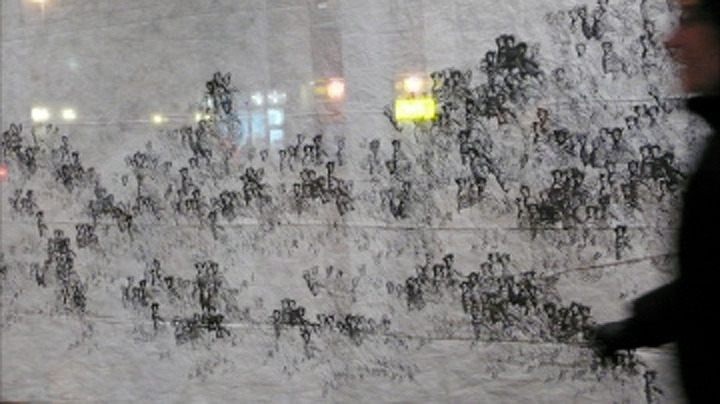
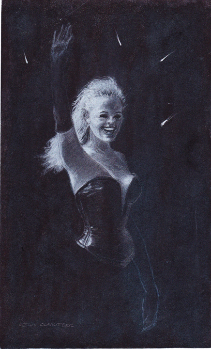
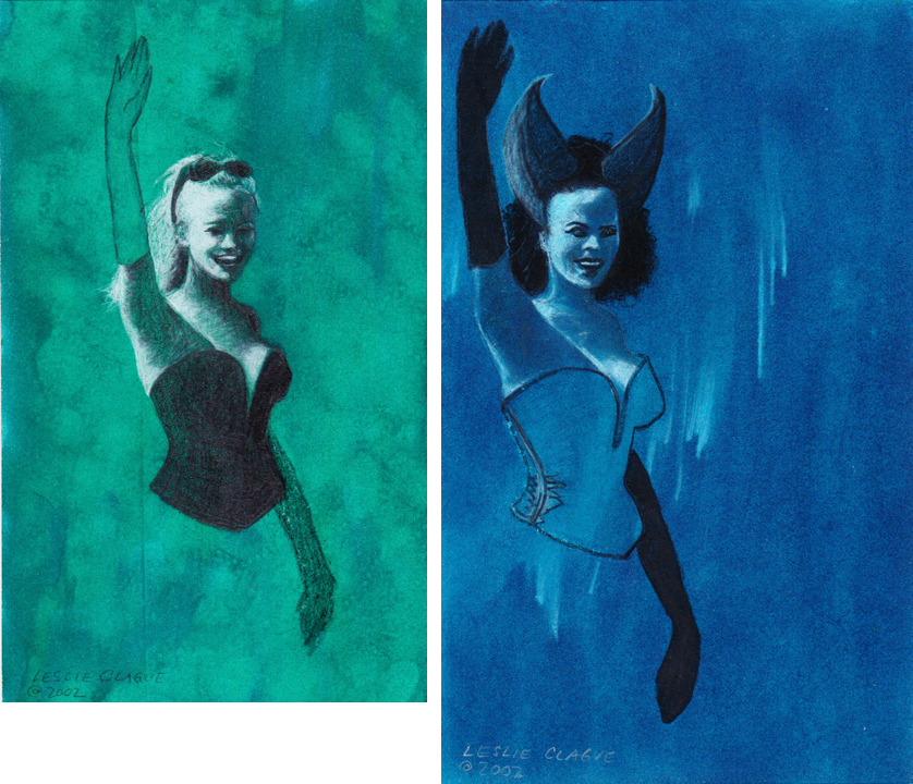
Like the Jumping Guys, the Pin-Ups (2002) are a series of drawings based on a mass media image, in this case a 1995 photo of Pamela Anderson at Cannes. Pamela, the sunny blonde bombshell of that moment, stands straight in a 3/4 view, (barely) wearing a plunging leather bustier that makes her look both armored and exposed. One arm is up, waving confidently; the other arm is down, gracefully echoing the line of her body. In the harsh sunlight, her eyes are dark pits –the photographer didn’t catch the small dots of light that would animate the gaze.
These drawings were done seven months after 9-11, when there was much warlike talk and loud patriotism and it felt like the country was slipping back to the bad old days. Something about this image felt like a perfect icon for the moment.
I did an online image search recently and quickly found the original photo (for reasons explained further down, I won’t share it here). There were others from the same event but they don’t have the same power. This shot was iconic, not because it shows a particular starlet with a radiant smile and an amazing rack; it’s the pose (and the angle at which it was captured) that take it further. She could be a queen waving to subjects, a sculpture of a goddess, a caryatid holding up the roof of a temple, 19th century engraving of Lady Liberty, a chorus girl or a comic book superhero. I liked the idea of turning this archetypal image into different characters. It was early spring in Seattle — gray, chilly and rainy. The prospect of drawing superhero ladies in different colors was irresistibly appealing.
Some of those associations are due to the corset or bustier, a stylized shape of the female torso — a tricky image/shape over-used to the point of exhaustion. For me, the shape is the armored female form and I used it in defiance of the stereotypes to communicate strength, confidence and self-sufficiency; to reference mythic women — Wonder Woman, the Valkyries, superheroines — and a world in which a woman’s body doesn’t make her vulnerable.

After doing a couple of one-off drawings I cut stencils from plastic film so I could quickly get down the basic shapes of the figure, reducing the amount of time it would take to draw the same figure repeatedly.

For each drawing, I put down a strongly colored ground in dyes or gouache, stenciled in the basic shapes, then started playing with the image, stopping when I liked what I saw. On some drawings, that moment came early in the process, with just the quick pencil sketch elaborating on the stenciled shapes.
Other drawings were more developed.
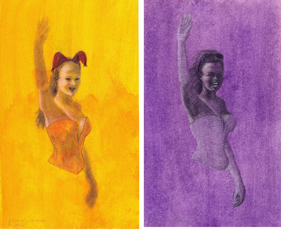
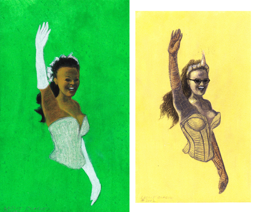
A few played with cultural stereotypes — sexy librarian, bride, devil lady. The librarian got armor and a horn, the bride was fairly straightforward. The devil lady looks like Nicole Kidman, although that was not intentional.
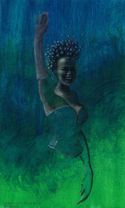
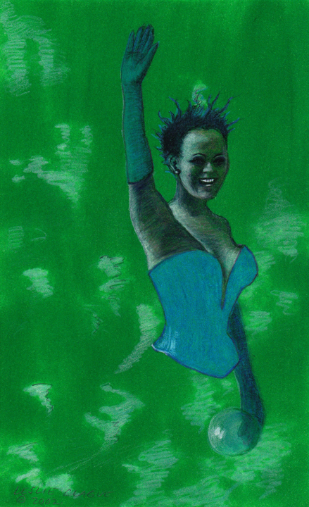
There were eighteen drawings in the first series, most about 5 x 9 inches. My favorites were the image at the top, the sea lady, and the one below, with the bubble in her hand.
My other favorite was the snow queen, which I don’t have a good picture of because selling that drawing helped me make rent one particularly tight month.

She was one of the more finished drawings, with an especially good smile and a pleasing color scheme. I said to the man who bought her, “you got the best one”. He said, serious and matter-of-fact, “I know”.
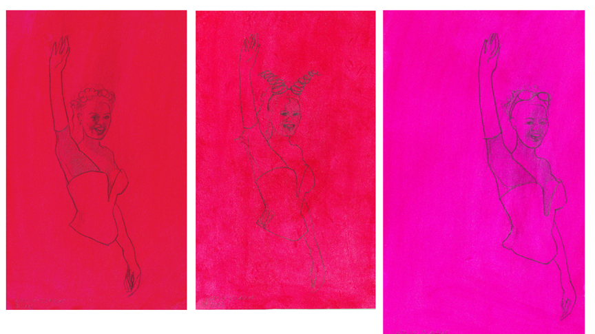
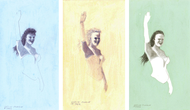
The drawings in the second series were smaller, about 4 x 7 inches, in pastel colors. Where the first series had been superhero-inspired, these reminded me more of beauty queens, or hostesses with slightly hectic smiles.
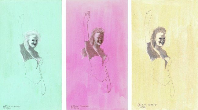
I like these in sets. There’s something appealing about a set of something in multiple colors. Your eye keeps going back and forth, instinctively looking to pick the one you like best.

Lots of artists around Seattle at that time were making small multiples — things that could be made quickly and sold for not much, perhaps on First Thursday, when artists who weren’t showing in one of the galleries or alternative spaces might spread out a blanket in Pioneer Square, and sell their work direct to the public. It makes sense to have things at every price point, so that anyone who likes your work can afford to own a bit of it.
I wasn’t planning to get into the issues that come with using an image that someone else owns as a basis for one’s own artwork. It just explodes into all sorts of sub-issues and there aren’t any good answers and it gets frustrating. But using images from mass media as the basis for drawings is something I’ve done a lot, and it’s a pretty common artistic practice. It’s kind of unavoidable.
Because these drawings and many others I’ve done, are based on mass-media photographs, what I can do with them is limited. It’s probably okay to sell the original drawings, but if I sold postcards, t-shirts or other merchandise with these images would likely result in problems. I’m curious if putting the drawings online will generate a contact. Will the company that owns the rights to the original photo be able to recognize it in my work? Would they care?
Several years ago I had an experience that illustrated how things are changing. I was working at a small nonprofit and maintained their website and blog. Some kids organized a show with some bands in the neighborhood and asked if we’d post about it. I used the small homemade flyer they provided to illustrate the post. There were two small black and white photos collaged on the flyer. I don’t remember what they were.
A couple months later a thick business envelope arrived from one of the largest photo licensing companies (hint: starts with a G). One of the photos belonged to them and there would be serious legal consequences if a digital licensing fee was not promptly paid. Their image searches — are they all automated? — to match a small section of a homemade flyer with a photo in their catalog, which contains tens of millions of images.
A couple of phone calls and things were resolved. Because the website belonged to a nonprofit, the company wouldn’t pursue the matter if the post was taken down. They were courteous, but in a quiet way the whole thing was chilling. Using that photo on a homemade flyer didn’t impact it’s market value. But now the technology makes it possible for a large company to find every online use of any of those tens of millions of images they own and pursue payment on every single one. Many of the strongest images in our shared culture — historic, memorable or striking for whatever reason — are widely distributed and will continue to carry cultural weight and meaning, but regular people will increasingly be barred from tapping that meaning by referencing those images.
When I did the pin-up drawings the source image was seven years old. Most of the copies of the magazine I found it in had gone in the trash long ago. The image might have been familiar, but not so much that the drawings couldn’t stand on their own. Now that image is easily found — it was on the first page of results in my search. If I started a similar project today, I wouldn’t use a full image from pop culture, or one found online. I might use my own photo, go to a library and look at older materials, or use aggregate sources — an arm from here, a smile from there.

As the technology continues to develop, they’ll eventually be able to find those, too. I’m not arguing that no one should own images — some of my photos have turned out to have wider cultural value and interest, and a few of them have been taken and used by others many times. But there’s a space between an individual trying to retain ownership of their work and these image behemoths with the resources to track down every single thing and threaten legal action. And the law has not kept up at all.
I don’t know where all this is going. This is why I didn’t want to get into it.