
The last body of work I developed and exhibited was the Jumping Guys. This group of pieces began with quick gestural ink drawings on vellum. The image came from an advertisement in an Italian fashion magazine. I liked it because of the frozen motion, the oddness of the figure suspended in midair.
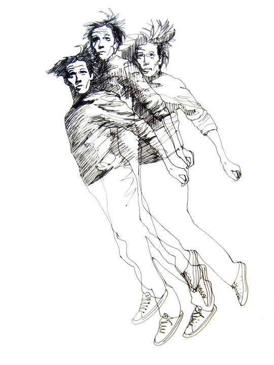
I became absorbed with the act of drawing these figures and fascinated by the way each face, although based on the same image, became an individual. I could draw this image thousands of times and each face would be different. It was compulsive; for a few weeks all I wanted to do was to draw this one figure over and over. This was a bit obsessive, but that level of absorption hadn’t happened in a long time and I welcomed it.

The semi-transparent vellum and the way the drawings also included whatever was behind them suggested the next steps. I scanned the drawings, converted the background to transparencies and began layering them digitally. As the groupings got bigger I became interested in the way the repeated gestures of the figures and the areas of light and dark could be layered and juxtaposed to create larger shapes. It reminded me of flocks of birds, or clouds of insects.

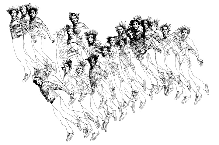
There was an opportunity to be a part of a group show called Behind Our Scenes at SPACE gallery in Pittsburgh’s Cultural District. The premise of the show was to bring together the work of artists who worked at the Carnegie Museums.
Still thinking of layering and transparency, I conceived of the figures as a cloud, like a swarm of gnats or a flock of birds in front of an also-visible backdrop. I proposed this for the show and the piece was chosen for placement in the large front windows of the gallery.
The graphic quality of the figures, plus the repetition, lent itself easily to silkscreen. I made several screens, each with a different small grouping, and with a good friend as an assistant, spent a a few late nights working at Artists Image Resource (AIR), a wonderful studio facility for printmakers.

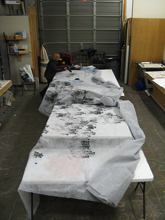
Printing on theatrical scrim, we slowly built up a cloud of small figures. Decisions about placement and massing were made along the way. The final piece was 24 feet long and 14 feet high.
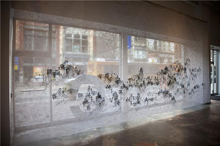
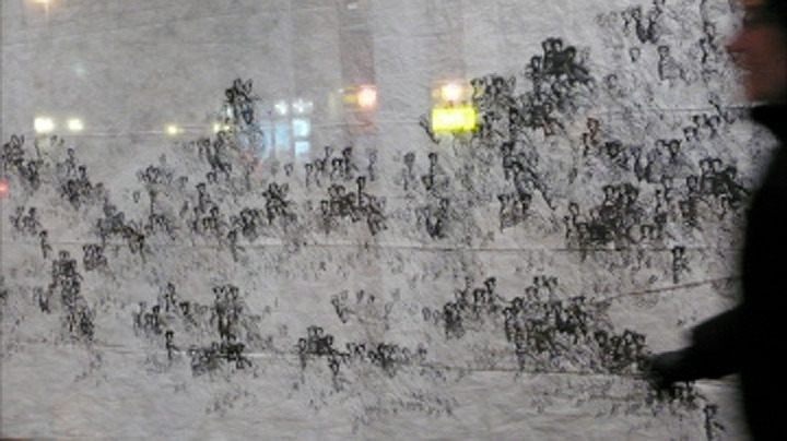
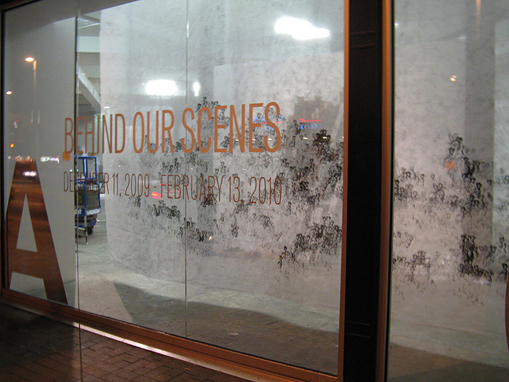
I was pleased with the technical quality (with dozens of silkscreen prints, there was not one misprint or drip) but ultimately the piece felt a bit bloodless. It didn’t go any further than initially conceived, and the scale overwhelmed the image.
My favorite piece from this body of work, which includes dozens of drawings and prints, is this one.
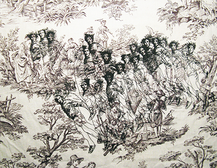
This was a test print, done before we’d started on the large piece, and never intended to be anything more. I’d brought a bunch of fabric from home to see if the screens printed well. Most of the material was plain, but I grabbed a couple pieces of this faded toile. It works because the figures are in similar scale, both graphic line drawings on white ground, and they meshed together in an interesting way. The different styles — one traditional, one contemporary — also create a back and forth that makes it more interesting than the large piece. This isn’t big, it’s not the technically best print. But it ended being the most interesting piece from the project.